
 Every day begins in the same way. I get up. I make my coffee. I look at the data. Everything about this is absurd. To begin with, there’s the absurdity that everyone with a job like mine faces each day. Locked down at home with the kids, trying to get things done, unable to properly teach, write, or think. The household is like a little spacecraft, drifting in the void. Occasionally you venture outside to get supplies, or to check the shields. I find the days are speeding up now, because even though things drag from moment to moment, each twenty-four hour period is essentially identical. It reminds me of when my children were newborns. It’s a daily slog that, in retrospect, fuses into a gray blob almost impossible to recall in any sort of differentiated way.
Far better, of course, to have a mild case of lockdown ennui than to be in the situation of those directly fighting the pandemic, those whose health or livelihood has been devastated by it, or those who carry on out in the world, working to fulfill essential roles. I see some of them individually, at my door or in my social media. I see them in the aggregate in the data. There’s so much data. People working at international agencies, universities, newspapers, magazines, and state and local governments put out more each day, trying to capture the scale and scope of the pandemic. And it’s not just official agencies and businesses, either. One of the best sources of daily information on the pandemic in the United States is being run by a rapidly-assembled team of freelance journalists and volunteers. The COVID Tracking Project was brought into existence by the realization that the Centers for Disease Control were failing to provide the sort of daily updates on case counts and deaths that was part of their reason for existing.
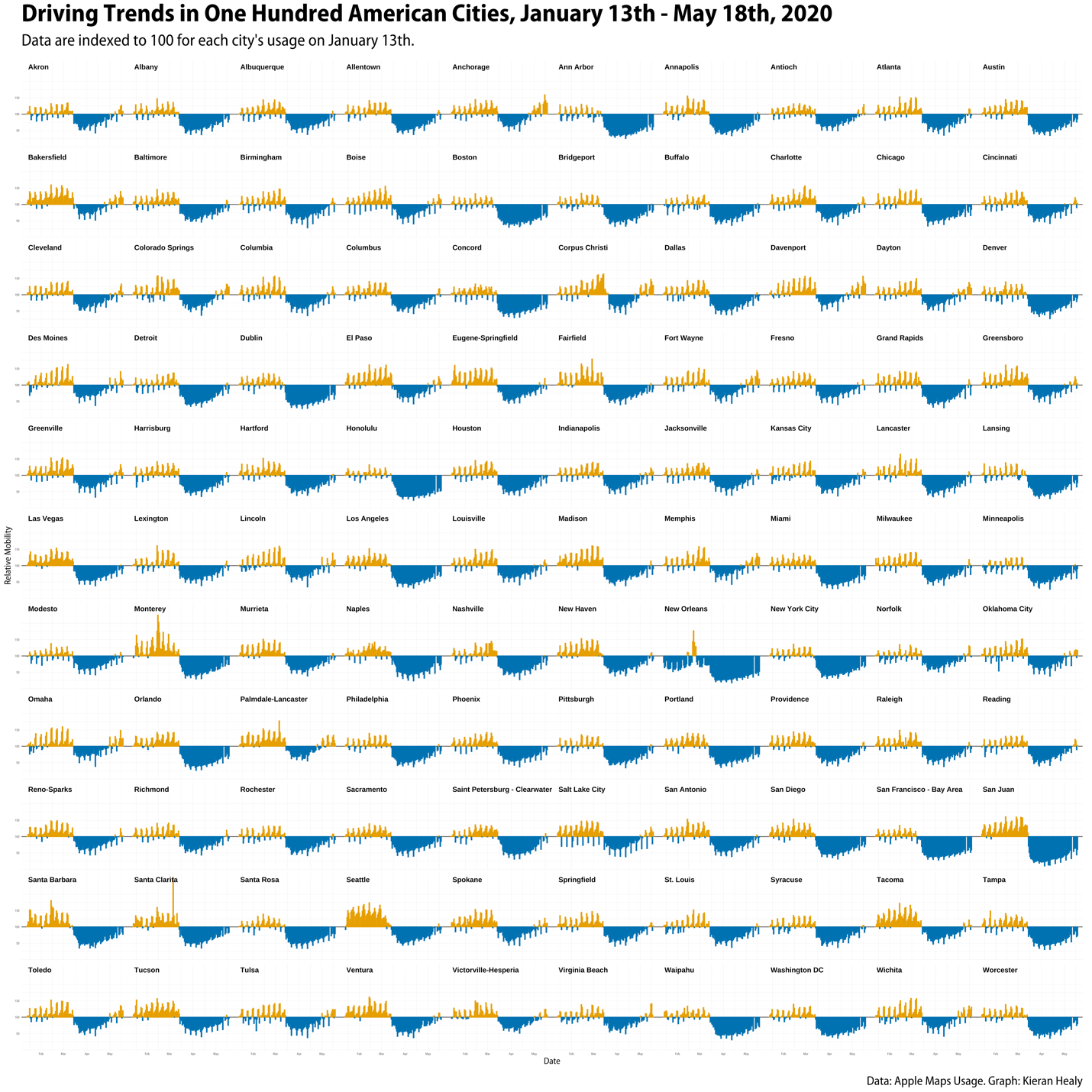
With a laptop, some free software, and a cup of coffee, I can examine what ought to seem like a staggering amount of information. Here, for example, is a picture showing what driving patterns have looked like every day in one hundred American cities over the past four months. As if that were a reasonable thing to be able to know while confined to your house! I drew it using information that Apple has been releasing to help researchers quantify the scope of the lockdown around the world. At this point, the full dataset has about half a million observations in it. Google is putting out a similar resource, about four times as large, that lets you see how busy different kinds of places are around the world over the same time period. This sort of thing doesn’t count as “big data” anymore. Back when I was a graduate student, I spent three days in a library manually copying down a few hundred numbers from a long-shelved report about blood donors. Now I sit here at home, surveying the scope of what’s being inflicted on people across the country and around the world as this disease spreads.
People sometimes think (or complain) that working with quantitative data like this inures you to the reality of the human lives that lie behind the numbers. Numbers and measures are crude; they pick up the wrong things; they strip out the meaning of what’s happening to real people; they make it easy to ignore what can’t be counted. There’s something to those complaints. But it’s mostly a lazy critique. In practice, I find that far from distancing you from questions of meaning, quantitative data forces you to confront them. The numbers draw you in. Working with data like this is an unending exercise in humility, a constant compulsion to think through what you can and cannot see, and a standing invitation to understand what the measures really capture—what they mean, and for whom. Those regular spikes in the driving data are the pulse of everyday life as people go out to have a good time at the weekend. That peak there is the Mardi Gras parade in New Orleans. That bump in Detroit was a Garth Brooks concert. Right across the country, that is the sudden shock of the shutdown the second weekend in March. It was a huge collective effort to buy time that, as it turns out, the federal government has more or less entirely wasted. And now through May here comes the gradual return to something like the baseline level of activity from January, proceeding much more quickly in some cities than in others.
I sit at my kitchen-counter observatory and look at the numbers. Before my coffee is ready, I can quickly pull down a few million rows of data courtesy of a national computer network originally designed by the government to be disaggregated and robust, because they were convinced that was what it would take for communication to survive a nuclear war. I can process it using software originally written by academics in their spare time, because they were convinced that sophisticated tools should be available to everyone for free. Through this observatory I can look out without even looking up, surveying the scale and scope of the country’s ongoing, huge, avoidable failure. Everything about this is absurd.